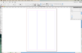
File > New > Document (the book option is too complicated)
The page size will be the size that your final print out will be.
Columns, slug, bleed and margins all assist with creating your layout.
Columns come with a gutter so that the text is readable once in the columns.
Margins create edges around the document.
Bleed is one of the most important tools, as it extends the edge of the document so that any errors when trimming the page are not noticeable, such as white trim marks.
The standard bleed amount is 3mm.
Slug defines an area larger than the bleed margin and is used for trim marks, or print registration marks/colour swatches.
Facing page options -Depends on whether you are creating a book or a booklet.
Facing pages displays them as spreads.
 This is how the pages look when not in facing page mode, they get displayed as singular in the page pallette.
This is how the page is displayed in the facing page options. The first page is displayed singularly, whilst the rest are shown as actual 2 page spreads.
Adding text is created by clicking and dragging onto the page in a frame. You can add your own text or, on the type options menu, you can fill the frame with placeholder text if you are simply experimenting with layout.
Adding images -
Workshop 2 - Mimicking Layouts.
In the second workshop, we learnt about recreating some pre existing layouts, which was actually really useful, and I finally got to grips with using grids and rulers, which I hadn't worked with previously (awful, I know).
There were a lot of elements that needed measuring into the layout, which took a while, and getting it precise was also difficult at times.


No comments:
Post a Comment