
Designing for Print - Adobe Photoshop
RGB - Red, Green, Blue - Designing for screen, RGB is additive, when the colours overlap they create white light, unlike CMYK that creates black.
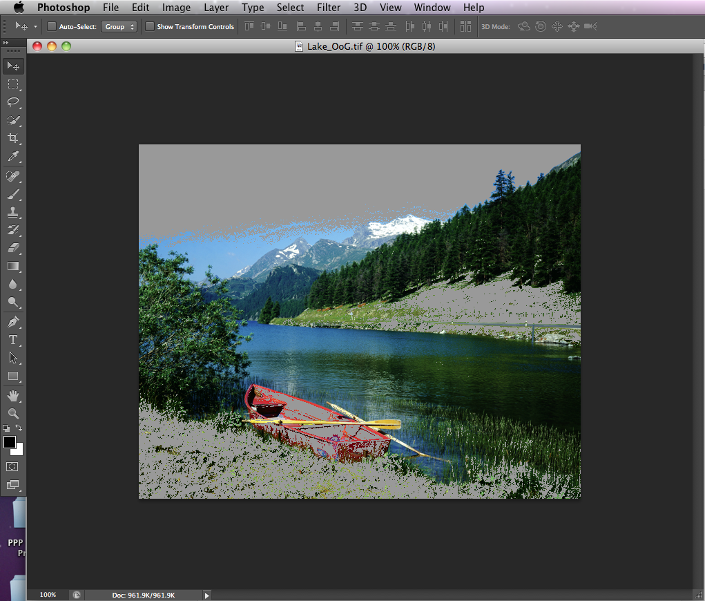
Many RGB colours sit outside of the Gamut (range) that is capable of being produced by CMYK. This is why the colour modes are so significant.
Filter options in photoshop are also different between the two colour modes. This means that Photoshop's default mode is RGB, not CMYK.
When working with images in Photoshop, you can change the colour modes so they are either suitable for screen or print.

Gamut warnings allow you to view any colours on the image that would not be printable using CMYK, which then allows you to adjust and alter the image so it is able to print correctly.

To ensure your image will print in CMYK, there are several adjustment options.


Adjustment layer


Colours in Photoshop
Swatches Palette - To delete you must press alt and then click on the colours to delete them.

The RBG percentages just slide to create different swatches.

Or you can click on the foreground colour which will then bring up the colour picker.

On both of these options, Photoshop will warn you about which colours are out of the CMYK Gamut by alerting you with an exclamation icon.
Lab colour mode?
Using spot colours
From clicking on the foreground swatch, you can then choose to go onto the Colour Libraries which will give you the spot colours.

However, there is no link to the swatch's reference number when working in photoshop when simply applied to a photoshop artboard.
Therefore we need alternative ways to apply spot colours.
To create a duotone (two tone) image, the starting image has to be grayscale. When converting the levels need to be considered and possibly adjusted to get a better contrast.


Monotone mode (one colour)


Playing with the grayscale curve, to determine the levels of spot colour and tint.


This can then be saved to transfer over to InDesign, however, there are certain formats that do not support Monotone, such as JPEG files.
Duotone can be chosen from the same drop down list, and will provide you with two inks to choose.

In terms of printing economically, it's important to consider what your spot colour images will be used for. If, for example, they were to be used in a layout that already included CMYK colours, you will be increasing the amount of printing plates you need.
Channels can be applied to any image. Using the select tool or the magic wand, you can pick out certain parts of an image, and then on the channels window, you can click on the rectangular icon with a dot inside it. This will then create a new channel that can be altered.


Applying spot colour to the image with channels


The spot colour can be applied using the paint brush tool, the selection tool etc.
This technique would be suitable for spot varnish finishing, where you would use a specific colour that isn't already part of the image, so that printers can then be told that this particular spot colour is for spot varnish only.
Spot colours can only be used in a commercial printing process. Laser/Inkjet printers only use CMYK.
No comments:
Post a Comment