Techniques for print production when using inDesign
Even when creating a book, it is better to choose to create a new document when using inDesign.
When choosing page size, its important to realise that this determines its finished, printed size, and is not simply for use as an art board of sorts.
The guides displayed (margins, columns, etc) are important for creating consistency, especially when creating a publication.
The bleed is important to use as they extend your colours and images off the page, so that in the event of problems with trimming the printed pages, it will not be obvious.
The slug is used for registration marks, crop marks etc, it defines an area outside the page that will print. It is rare to need it.
Primary text frame is designed for setting a large amount of text being used in a document.
The pages window displays the setup of the document, it is set up to look how it will once printed. It is easy to use to navigate the whole document, as you can simply double click on a page to be taken there.
Using colour in inDesign is applied using frames.
The swatches palette is similar to the one used in Illustrator. Displayed here in its default list setting, it allows you to see the percentages of CMYK used in each swatch.
The colour can be applied to either the frame stroke or the frame fill, which is done by clicking the boxes in the top left hand corner.
The small grey square allows to you to apply text the background, and the T symbol allows you to apply colour to the actual text.
Creating new colours in inDesign is similar to the way you create them in illustrators.
To create a tint of a particular colour, which works with both spot and CMYK colours, you simply choose the option from the menu after selecting the desired swatch.
The preparation of any images used in inDesign is important. Images should have been created and prepped in either illustrator or photoshop, and are simply being added and laid out in inDesign.
Photoshop images
Photoshop images should be converted and saved as CMYK/Grayscale.
Resolution should be set to 300 dpi.
The images need to be set to the actual size they would print at. If you resize in inDesign then your image quality/print quality will be altered.
Images from photoshop should be saved as PSD or TIFF formats. PSD is preferable for editing and working with layers and transparency.
Illustrator images
Should be saved as .Ai
Can be copied and pasted into inDesign.
CMYK
Illustrator artwork can be scaled in inDesign because it is vector based, no sizing settings are really necessary.
When adding images into inDesign, you should use the Place option from the File drop down menu.
Once opened, any images that use spot colours will show up in the swatches palette.
When placing images from both photoshop and illustrator, the preview you will get will only be low resolution.
If you place a grey scale tiff, you can apply colour to it in inDesign.
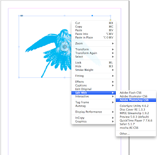
When working with linked photoshop images in inDesign, you do have the option to edit the actual photoshop file whilst in inDesign.
When using CMYK, the printing process will use 4 separations of C, M, Y and K. The way to view the separations is by going to the windows menu > outputs > separations preview.
You will then be able to view the separations both together and separately, using the eye tool.
This is a similar process to screen printing, where separate screens are needed for different colours being used in the image.
It is important to ensure in the separations palette that only the swatches you need are present, as the positives will be output when printing. Any unnecessary positives will create more cost.


No comments:
Post a Comment