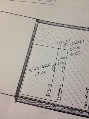
What I took into the Crit.
Questions I asked
Is the idea of having two books joined together something that would engage the viewer and make sense, or is it too fussy and complex?
Would using the dust jacket for the book as a glossary be something that is useful, or would it get ignored by the viewer?
In terms of cohesion between all the products, should I use the same colours/stocks for each, or experiment with different stocks and colours?
Would the viewer engage with the book first or the postcards? Do you think this would affect the product?
Strengths
The proposal for the book is complex but interesting, it would work well.
It is visually engaging, categorised well and is interactive.
The dust jacket is a good idea, another opportunity to share information.
Areas for Improvement
Maybe use different stocks but in the same colours as there needs to be a colour scheme.
Design for print shouldn't be written around the box, it might be mistaken for a mistake.
The majority of information should be in one book for easy reference.
Considerations
Depends on the finished product, if the book looks better then you would look at that first, however the postcard idea is very effective.
Use of different stocks depends on the feel of what you want to go for. It would look professional and classy if you only use one stock but fun and trendy if you use lots.


No comments:
Post a Comment