This was a design sheet I drew up based on takeaway packaging, and I was looking at the organisation of the box and how to create something for that.
As it's a takeaway restaurant, and the concept of the restaurant is boxed food, I am working with the concept for this packaging as a sleeve that will cover all 3 compartments of the box, keeping it secure and looking slick and neatly packaged up.
I also want to include nutritional information on the box, as japanese cuisine is incredibly healthy, which is something many people are concerned with and want to know more information about.
 |
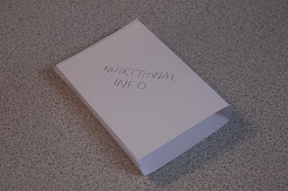
| A Small Mock Up of the Food Sleeve |
These are some examples I think work well.
I think this is more of a sticker, but I like the use of typography and the fact it only covers a small part of the box and there is still a window to see the food. I just don't think that making a small sleeve would work for my designs, as It wouldn't hold the boxes very well.
I really like the design of these boxes, which are quite playful and very design led.
In terms of design, I want to create something similar to the menu design, keeping the concept of the box and the ingredients as a design element, so that it displays information in a clear way. I also want to display the information in a similar typographic style, which is something I think the target audience will appreciate.
This is the design of the nutritional information, which has used the same colours, type and box style as the menu, and I think it works really well aside from some minor technical errors. I have tried to include both nutritional information and useful tips and mini side notes so that it isn't totally boring people with health information, and I've tried to use a mixture of pt sizes again to create visual interest.
Although the menu is in black, I think I like this as a white background as it feels fresher and reads better than when I experimented with black as the background.
Because of all the information on the back of the sleeve, I wanted to keep the rest of it very simple, and so I've used something similar to the Japanese logo, but using a simple phrase, and I've also used the Japanese translation so that it fits aesthetically with my other designs. The red placed in the centre reiterates the fact that the cuisine is Japanese, as the design is similar to the Japanese flag.
The sides of the sleeve are just going to have the slogan placed on them, as I feel it will look good, but keep things simple and balanced.
I also want to use a pattern on the back of the sleeve to add interest and to make it feel more professional, as a blank side would look boring and rubbish.
The final design is now ready for print!


No comments:
Post a Comment