
For my booklets, I want the layout style to be very clean, simple and minimal, as I want the reader to simply focus on the quotes, and I think trying to create 4 booklets with a complicated editorial style would be kind of foolish, and I'd risk it all just looking terrible.
I've found some inspiration online, that have a similar clean style that I want to achieve.


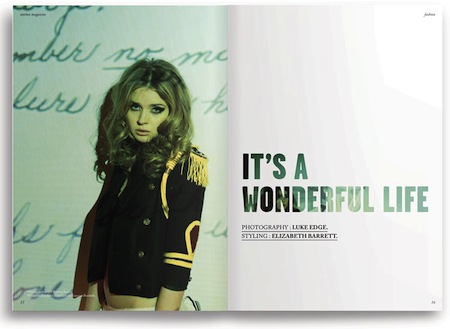
I think this is possibly one of the most stylish magazines I've ever seen. The sans serif typefaces, black and white images, and use of white space all work very well together to create a beautiful, unfussy aesthetic that allows the reader to focus on the photography and the fashion featured in this publication.
Despite its simplicity, it retains a cool edge (even though writing that leaves me feeling very uncool) and also feels like it has a sense of humour, thanks to the photography and the use of text.

Found Via Visualise US
I now have to think about how I want my publications to look in terms of editorial and design.
Because they will be mainly text based, the most important decision in terms of design will be the use of typeface within a layout. I like the typefaces used by Station Zine and Dapper Dan, as they are simple, stylish and sans serif.

Testing them out, the best options are Bebas Neue and Trade Gothic. However, I would like to use Trade Gothic more because I think I have used Bebas Neue a lot in other designs, and I would like to try a variation. Plus, the trade gothic typeface is less condensed and has better spacing, so will be easier to read.
I also need to think about the leading of the text, and the presentation.

I experimented with using longer quotes that involved interactions between different characters, as some of the best quotes are from dialog between 2 or 3 people. In terms of design though, I don't think this works very well, and would probably be better if it was simplified.


I really like this style of editorial as it is very simple, central and clean. Small quotes work well like this as they have an immediate impact. I also thought it would be a good idea to link the quote to its specific season and episode underneath, although I am unsure whether it would look better directly underneath the quote, or positioned centrally at the bottom of the page.
I am going to keep working in a similar style to this, as I feel it will work well with the amount of text I am using.
No comments:
Post a Comment