One of my printed products is the wrapping paper that the cheese will be packaged in. There is no text necessary on this printed product, it is a very simple element of the branding, and so I think it just needs to be visually striking.
 Taking inspiration from Here Design's branding of Lina Stores, I will be using the striped pattern that I have been working with in my initial logo ideas. The striped pattern is an element I would like to repeat throughout my identity, and so it makes sense to use it here. The candy stripe pattern is traditional and also aesthetically pleasing, and works well with the other branding that I have used. I have used the blue colour instead of the red, as I have used the red more throughout the branding so far and I want there to be some visual contrast.
 The pattern will be printed onto tracing paper, which will work visually as well as practically.

 Taking inspiration from Here Design's branding of Lina Stores, I will be using the striped pattern that I have been working with in my initial logo ideas. The striped pattern is an element I would like to repeat throughout my identity, and so it makes sense to use it here. The candy stripe pattern is traditional and also aesthetically pleasing, and works well with the other branding that I have used. I have used the blue colour instead of the red, as I have used the red more throughout the branding so far and I want there to be some visual contrast.
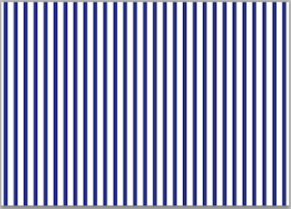
  The pattern will be printed onto tracing paper, which will work visually as well as practically.
No comments:
Post a Comment