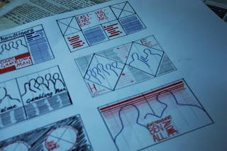
In our second workshop with Lorenzo, we started to look at deconstructing and reconstructing magazine layouts we felt weren't looking at their best. My magazine of choice was TV Choice.
Now, in all fairness it does only cost 42p, so you can't expect quality of layout to be a number one priority for them, especially since it is a weekly magazine, but, I did feel like there were ways for it to be improved. Before the workshop we looked at working out the grids for our magazines, and mine was more than a little confusing. The columns and the gutters weren't equal, and neither were the margins etc.
I ended up deciding that there were 4 columns measuring approx 4.3cm, along with a gutter of about 5mm each time.
There was an average of approximately 5 words per line of 10 picas.
I worked out the point size of the body copy as 7pts. The titles I struggled with, but Lorenzo explained that was because the titles were probably a negative leading, and only one title had a descender which was why my workings out for the other 2 titles ended up being incorrect.
After drawing up the grids, we then started working on our layout designs.
At first I found it quite challenging trying to use the space and thinking about elements such as overlaying the image with text, resizing images and drawing out text as white was also difficult as I didn't know how to communicate it on a small scale, but once Lorenzo showed us some examples of good layout design I began to experiment a little more, emitting some of the visual information and text so that the pages looked less crowded.
This is my favourite layout and the one I think would work best mocked up on a larger scale.
I think that it still looks formal and would work in a similar style that the magazine already employs, but it justs refines it slightly and makes it look less cluttered. The text would be white and overlaid over the image, whilst the text would be in a white block justified to the left. The columns would also be either justified left or centred, but I want to experiment with that element on a larger scale.


No comments:
Post a Comment